


Gordon Williamson
-
Posts
5,391 -
Joined
-
Last visited
-
Days Won
3
Content Type
Profiles
Forums
Blogs
Gallery
Events
Store
Posts posted by Gordon Williamson
-
-
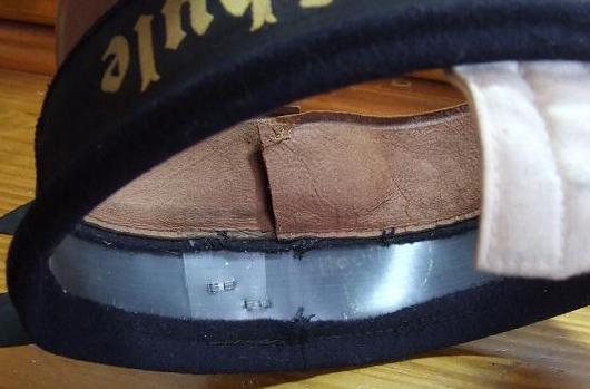
The actual stiffener inside the band is usually a greyish/blue opaque celluloid material.
 0
0 -
This is what I'd expect to see once you remove the cover from one of these, very little remains, just the blue cloth covered band stiffener with sweatband sewn directly to it.
 0
0 -
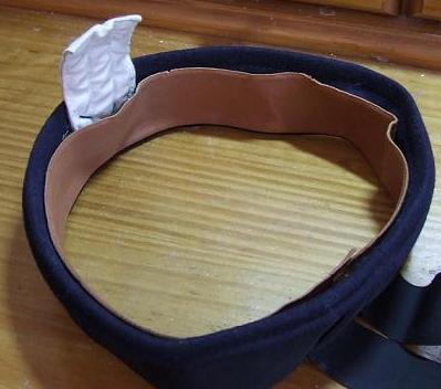
Just for comparison, here is a real one that Michel picked up at Kassel and very kindly passed on to me.
 0
0 -
Michel is the expert on these, I'm sure he will chip in when he sees it but my own feeling is that it is an early postwar Bundesmarine cap. For sure, the August Geiger firm survived the war and was active making Bundesmarine headgear. I've never seen an original Matrosenm?tze with lining like this to the crown. Also it looks very much like the bead of pvc like material that connects the sweatband to the band of the cap. The originals I have had have always had the sweatband sewn directly to the cap.
Wait for Michel's verdict though.
0 -
No firm release date yet. Roger Bender is chasing up a couple of rare pieces in the USA ( including an original ships bell from a U-Boat) for inclusion. Once these are in and the final adjustments to layouts are done, the cover illustration is chosen and a final descion made on the title and we are ready to go.
0 -
Most collectors who have dabbled in the field of German Navy cap ribbons will be aware that there has been considerable disagreement over the years on the subject of the form of letter ?s? used in the Gothic script characters of the cap ribbons of the Kriegsmarine, and more specifically, whether the appearance of the Gothic rather than ?stroke? form of letter ?s? may at times be an indicator that the ribbon is a post-war copy.
The fact of the matter is, that the use of Gothic or Stroke type letter ?s? was not decided on the basis of mere manufacturers whim, but rather by strictly enforced rules of Grammar.
When the new West German Bundesmarine was formed, the use of Gothic script characters for ships cap ribbons was continued for a short period of time and ribbons from this period bear a strong resemblance to those of the Kriegsmarine. So much so that many are now passed off as wartime and some have even appeared as such in major reference works. Some of these bands, such as those for the Schiffsstammabteilungen, may well have been old wartime stock, but most of those for other units and individual vessels were newly made. Ribbons manufactured during this period did not adhere to the same rules of Grammar as did the wartime bands and the use of the Gothic style ?s? was almost universal. There are additional clues as to the post-war origins of some of these Gothic script bands lying in the nomenclature used. For instance there exist post-war Gothic script ribbons for numbered Schnellbootsgeschwader, whereas the Kriegsmarine S-Boats were organised into Flotillas, not Squadrons, hence the Kriegsmarine ribbon would read Schnellbootsflotille .
To return to the question of the form of letter ?s? used, the simple rule is that if the letter appears at the end of a word, or a syllable, the Gothic form is used.
This is complicated however by the German use of compound words. What may appear to the English reader to be an ?s? within the body of a word, may be at the end of a part of the composite word. Hence in Torpedobootsflotille, the ?s? is actually the final letter of the word ?Torpedoboots?. Indeed in the older Imperial ribbons many such compound words are split by a double hyphen, so that Torpedobootsflotille would appear Torpodeoboots=Flotille, showing that the ?s? is indeed at the end of a word.
An exception to the rule of the Gothic ?s? being used at the end of a syllable, is when the following syllable also begins with an ?s? or a ?p?, or if there has been an ?e? dropped. ( i.e. the word Unsere is often written with the first ?e? dropped, thus ? unsre,) in which case the Stroke rather than Gothic ?s? would be used. This exception only relates to parts of a syllable, not the components of a compound word, where a Gothic ?s? may precede a Stroke ?s?.
.
In all other instances, where the letter ?s? appears within a word, it is used in the Stroke form, thus Zerst?rer, Linienschiff, Panzerschiff. Schlachtschiff, Versuchsboot, Segelschulschiff, etc.
What confuses the matter even further is the fact that of course both forms of ?s? may appear in the same compound word, hence Unterseebootsflotille ( Unterseeboots=Flotille) uses the Stroke form of ?s? within the body of the word ?Unterseeboots? , but the Gothic form at the end.
It is assumed that when, post-war, ships tally ribbons were made up for crew associations, and the collector market, the firms responsible were those who also wove the early ribbons for the Bundesmarine and that they simply used the same letter forms for their replicas. This when such post-war made ribbons for the Scharnhorst, Graf Spee etc are encountered, they invariably use the Gothic ?s? throughout.
Hopefully this brief explanation of the Grammatical rules will help collectors avoid purchasing these post-war copies or early Bundesmarine tallies in the belief that they are original.
One last warning in relation to cap ribbons for the Scharnhorst. An excellent copy exists which is made from natural materials, being woven in cellulose type thread on a silk base, with no nylon or other ?give-away? materials used, and which uses the correct stroke type ?s?.
It is believed that such ribbons were made in the UK and were sold as souvenir copies at the historic cruiser and Battle of the North Cape veteran HMS Belfast in London, along with remade examples of the ?HMS Belfast? ribbon. These ribbons however, were cut in the same way as Royal Navy ribbons, much shorter than the German style, and with the text offset to one side rather than central. To disguise this fact, many were cut down to leave only a few inches of ribbon either side of the lettering and in this form are very hard to detect. Collectors should therefore be wary of any Scharnhorst ribbons which use the Gothic ?s? or which use the correct Stroke type ?s? but have been cut down.
0 -
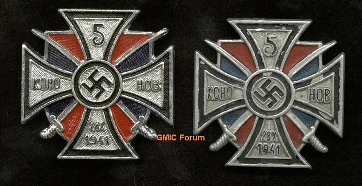
Here is another comparison, 1970s fake on the left. Note the curvature of the numeral "9" in the date of the fake, and the typical extremely dark blue shade of the paint on this particular style of copy.
Also, on the original if you look closely, you will find a slight raised vertical line above the "28" on the date in the lower arm, from the groove for the pin on the reverse.
 0
0 -
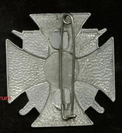
I'd have to say this looks like a postwar copy. Originals didn't have that very coarse pebbling to the reverse and were fitted with a steel pin rather than brass. Here is the reverse of one which is believed to be a genuine wartime piece.
 0
0 -
The basic Hymmen design is shown on this wartime propaganda postcard from the "Tag der Wehrmacht" series, complete with characteristic "filled-in" area around the neck.
 0
0 -
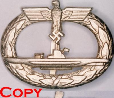
Interestingly, the Hymmen badges were often shunned because they appeared the same as a well known fake available from a certain well known source in Arizona. It appears however that the fake has modelled itself on this unidentified type - note the appearance of the above characteristics of the unidientified badge on this fake. (Photo - Detlev Niemann) and not the much maligned Hymmen.
The fake at 50mm x 39mm is a couple of mm each way smaller than the unidentified piece, and lighter by 5 gr. The smaller size and lighter weight suggest it is cast, probably using this unidentified type as a "master". Note also the fake is fully voided around the neck of the eagle, rather than having the solid look of the originals of this style.
The fakes were available with a range of makers marks including Juncker, Schwerin and GWL.
 0
0 -
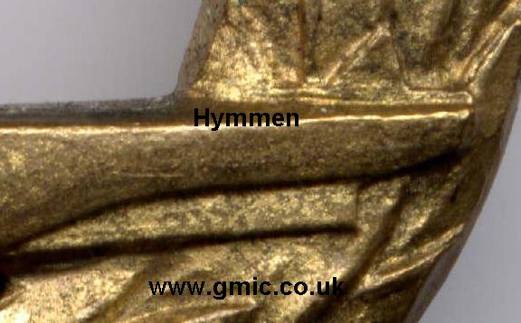
A smaller difference, but noticeable. The dividing line between the keel and the rudder is faint on the Hymmen piece but quite distinct on the unknown one.
 0
0 -
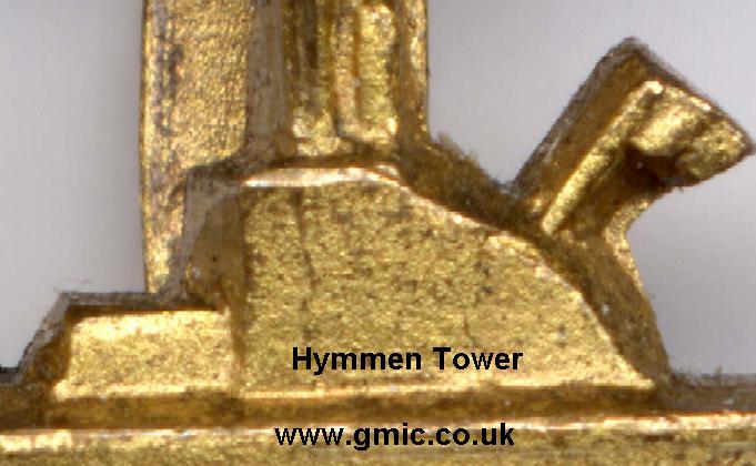
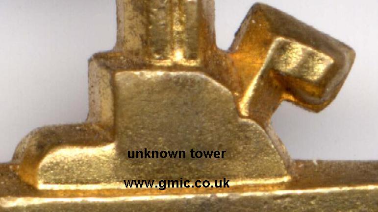
The submarine conning towers are different too.
 0
0 -
The unidentified piece is clearly not from the same tooling. Feathering and claws are quite different.
 0
0 -
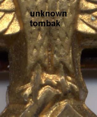
Next the eagle's torso. Again the Zink and Tombak Hymmens show identical characteristics.

 0
0 -
The head of the unidentified example howere, has different characteristics.
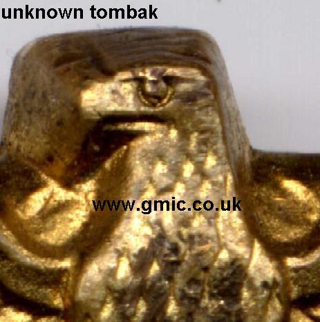 0
0 -
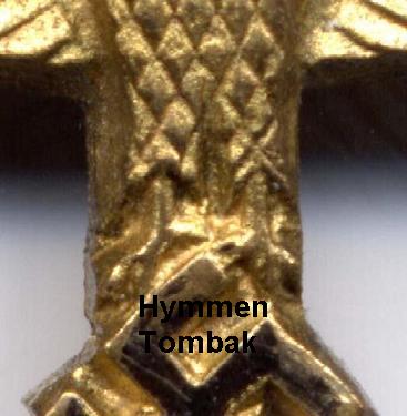
Starting with the eagles head. Compare the Zink and Tombak Hymmen pieces, which notwithstanding the excess metal left around the head of the latter, show the same die characteristics.
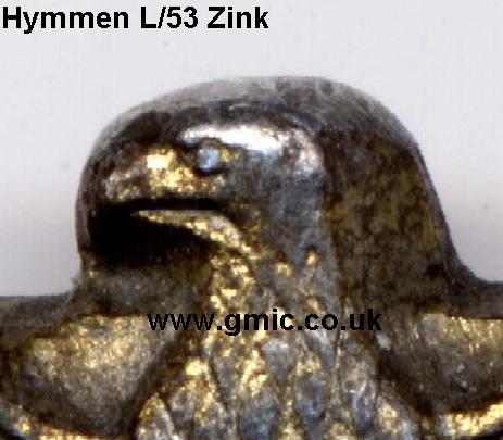
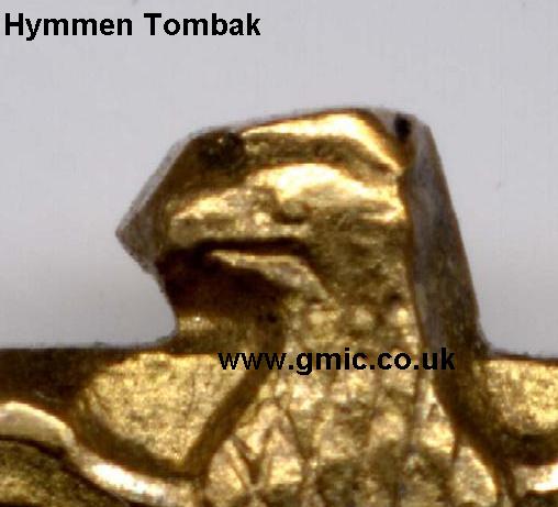 0
0 -
This type badge is known in four forms, Tombak with vertical pin, Tombak with horizontal pin, Zink with vertical pin and a hollow stamped version with horizontal pin.
Close examinaton shows however that they are not all from the same tooling, and so perhaps not all from Hymmen.
Here are three of this type. Top left L/53 marked zink Hymmen piece, top right unknown maker, bottom Tombak Hymmen piece.
 0
0 -
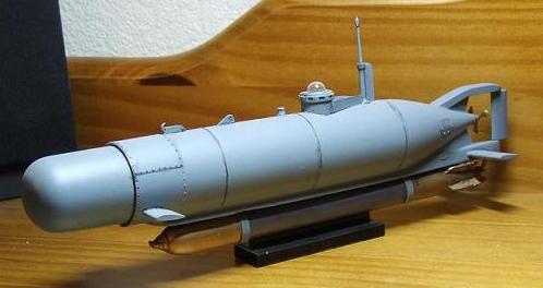
Yup, its the Special Navy kit . They are releasing a Type II at some point which should be rather nice if this Type XXIII is anything to go by.
Here is a 1/35 "Hecht" mini-sub as used by the Kleinkampfmittelverb?nde.
 0
0 -
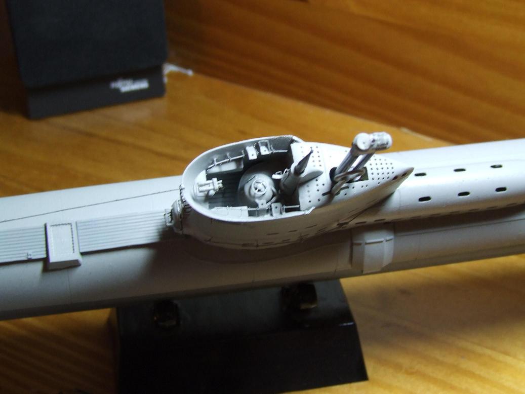
A look down into the conning tower (pardon the shaky hand). Not much room in there
 0
0 -
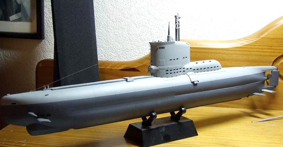
Late war Type XXIII U-Boat in 1/72 scale. Its a multi-media kit, part injection moulded plastic, part resin and part etched brass.
 0
0 -
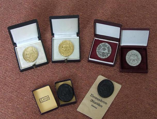
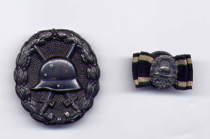
Don't really go much for 3rd Reich stuff any more but decided to add a set of 1939s (mostly thanks to DaveB) to go with my Imperial Wound Badges.
Cased Tombak Gold (30, needle pin) case with Hauptm?nzamt label
Cased Zink Gold (unmarked)
Cased Tombak Silver (30, Wide pin) case with Hauptm?nzamt label
Cased Zink Silver (65)
Boxed Black (unmarked, but mint example of the type with ultrafine stippled background)
Packeted black. (numarked, packet marked for Fritz Kohm Pforzheim)
 0
0 -
Would anyone sure of the subject be kind enough to post a good close picture of an iron cross core they consider to be 'stove enamelled' and not painted, blued etc...
many thanks!
Marshall
Are you sure we are talking of a different processes here ? Stove enamelling and painting can be the same thing. Stove enamelling is often used to describe a painting process using "enamel" or high gloss finish paints which are oven cured and give a good quality hard wearing finish. (like the painted finish on a WW2 German dress bayonet scabbard) It is used today on things like bicycle frames, so its a painted finish, not true vitreous "glass" enamel.
0 -
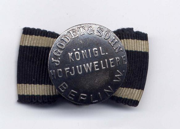
And the maker is .........
 0
0 -
Well spotted Rick ! Its a mini, though not a stickpin. Astonishing level of detail in this little gem, every bit as good as its full size brothers.
 0
0
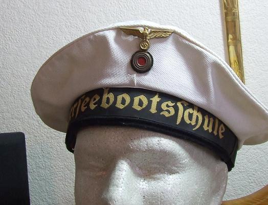
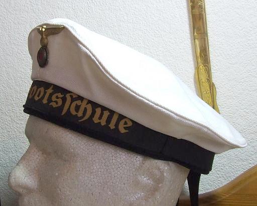
KM Summer cap
in Germany: Third Reich: Wehrmacht Medals, Decorations & Awards
Posted
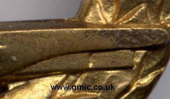
The makers stamp just visible.