


Tim B
-
Posts
2,234 -
Joined
-
Last visited
-
Days Won
2
Content Type
Profiles
Forums
Blogs
Gallery
Events
Store
Everything posted by Tim B
-
Hi James! Well, kind of nice to add something instead of just asking others questions all the time; glad someone is getting some use here. I should have a couple more in a week or so and can better compare once I have them in hand. I figure we can use this thread more as a workshop and once those variations are identified and maybe properly labeled, we can run a better thread or have an database type area where they can be used for reference. Tim
-
Okay, I'm done for awhile on these. I started out on the Fire Cross as I figured I only had three to really get and maybe a couple of variations, but it appears there are at least 3 Type I; 3 or 4 Type II that I know of so far and luckily, only 1 Type III (some refer to this as a narrow Type II). Still cheaper than German stuff! Tim OH! BTW... I showed a Type 2 version earlier with the slanted P & R in "SUPREMA". Has anyone ever seen this particular style mounted on a bar or in a collection that has 100% provenance? I am being asked. Thanks!
-
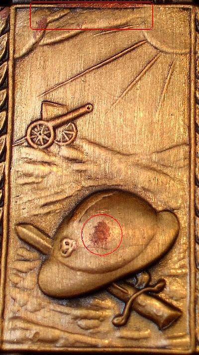
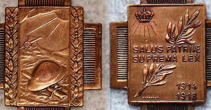
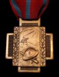
Again, the details are softer than period originals. Look at the designer signature. Red areas show the copper coming through on the high points, including the lettering. Notice this piece appears rough on the leaves and the brass finish must be pretty thin. Yellow areas show along the edges where you see evidence of file marks; perhaps where the flash was removed during the finishing stage. Quite poor workmanship and you would think this would have been done prior to the finish being applied. Light Blue areas show the die flaws in the corners. I don't see these on any period originals that I've look at. Anybody else have these on theirs? Tim
-
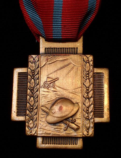
Here's the reverse and I'll point out different die flaws, etc, on the next PIC. Tim

-
Notice how soft the details are compared to other period pieces; namely the helmet lines, bayonet details and land lines. The red circle on the helmet shows the wear down to the copper base metal. This is evident on almost all the high points as you'll see on the reverse more plainly. Tim
-
Well, lots of viewing, not much posting, but thats okay. I am sending the restrike back tomorrow and wanted to post a few better PICs tonight so others have a good look at the areas Bjorn mentioned on his site. Tim Front: This has a replaced but correct ribbon as well.
-
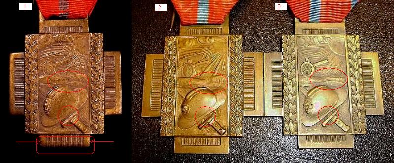
Now, take a close look at Rob's FC on the medal bar. It looks very close to mine (#1) but not exact and yet, it's not quite exact to (#2) either. So is this a 4th variation or ??? Tim Let's see some more!
-
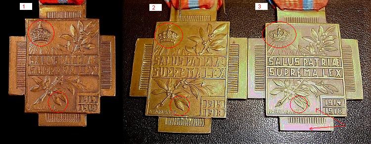
Now, for the reverse: First, the crowns on (1 & 2) are the same, but (3) is a completely different style crown altogether. Then, look at the leaf and all three are different from one another. Last comment on the FC on the right (#3); notice the strange oily hue to the finish (red arrows). ***New Update*** The look is just a play of the lighting in the PIC. Tim

-
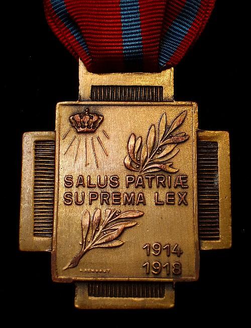
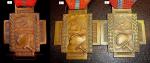
Now, for some new information. I have seen three different Type 1 Fire Cross' at this point. In the post below, the Type 1 in my collection is on the left and two more that I am being offered are center and right. I was so concentrated on the little details, that I missed a big one on the FC I already have. Looking at the bottom front, you'll notice that it's missing the bottom bar entirely! If you look closely (red arrows), you can see where there might be a line about where the bar would have been stamped. At first, I thought either the die got worn or the stamp got offset somehow and didn't stamp the bar fully. The front details are very close and the land details are too close to really differentiate between mine (1) and (2) without holding both in hand. However, (3) is different from both. Also, compare the spacing between the helmet crown and rim on all three and it appears the widths are slightly different. Looking at the reverse will show additional differences which lead me to believe (1) is a completely different variation and not just a light or off-struck (2) piece. Tim
-
Well, perhaps some progress afterall. First, here's the apparent Type 2 restrike (if we can call it that). One of the details that I was asking Hendrik about was the base metal. It appears this one is made out of copper and has a bronze finish applied. The PICS are not the greatest, but looking at the high points on the helmet and crown, you can see the copper color clearly. So, it goes back and the seller has already refunded my money in full after presenting this new discovery. It's okay, for the price, I didn't like the wear anyway and I still got a nice Type 3 out of the deal! Goes to show though what a little information can do. Tim

-
dcollect, Okay, thanks anyway. I did see what appeared to be these same die flaws and actually had emailed Hendrik when I first received the FC with the same questions/concerns. I have not heard from him on this, so the information you are providing is sort of what I was expecting, though not hoping for. It would be very beneficial for larger PICS to be shown though, so collectors that utilize your site, or those looking for answers here could see the details better. Nothing like a nice clear PIC for a good learning tool. Also, as this area of collecting seems so undiscovered to most, and we are discussing restrikes, do you have examples of other medals/orders that are current restrikes with the identifying die traits? This would be a huge benefit to collectors that do not want restrikes in their collections. I don't know what Belgian seller your talking about that sells a lot of restrikes, but would like to know so I can avoid him if possible. PM me the name if you don't want to publically name him; if you don't mind. I have delt with several Belgian sellers now and most are good, but have had problems with three to date that either send me a completely different item than the one shown or described or not sent the item at all. Very tiring! Thanks again Bjorn, Tim Oh BTW, your site looks much better than before. :cheers:
-
WW1 Victory Medals General Discussion
Tim B replied to JimZ's topic in Inter-Allied Victory Medals of the Great War
Well, be paitient Rob. Even if the decision was to have a place set aside in one of the existing sub-forums, I would be happy with that. I see a lot of areas where there is no movement for weeks at a time. Guess it all depends on who is collecting what and when. Right now, there are only a couple of people actively posting on the subject here, so I imagine Admin has to take that into account as well. Hey! At least we're having fun! Tim -
James, Might be okay (other than the unoffcial swords) as the palm has the Leopold III on it and that would put it probably Korea timeframe. If memory serves me correctly, those changed to the single "L" around 1952; the same timeframe that the center motif changed to the bilingual French/Dutch font. Tim
-
Hi James, Any pictures? I don't see any?? If the Leopold II has crossed swords attached to the medal, then yes, unofficial. However, we know they exist as veterans do have them in their collections. Either way though, the gold striped ribbons were for civilians that were recognized during wartime hostilities and should not have swords at all (on the medal or ribbon suspension). Tim Oops, I was too fast in my response; your PICS are there now.
-
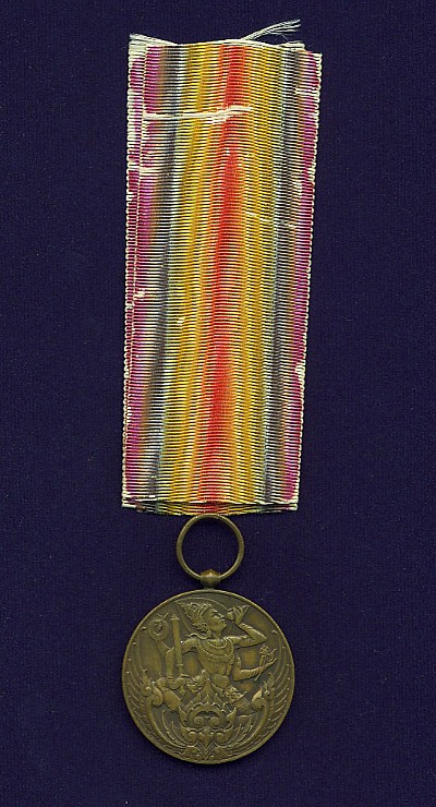
Thai/Siamese Victory Medals
Tim B replied to RobW's topic in Inter-Allied Victory Medals of the Great War
Yea Rob, it's a beauty and wonderful toning to it as well! Tim -
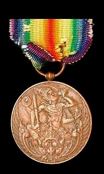
Thai/Siamese Victory Medals
Tim B replied to RobW's topic in Inter-Allied Victory Medals of the Great War
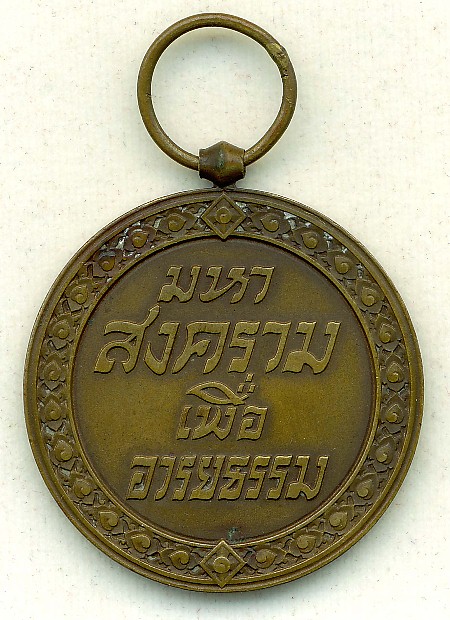
Reverse: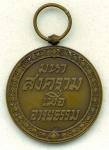
-
Thai/Siamese Victory Medals
Tim B replied to RobW's topic in Inter-Allied Victory Medals of the Great War
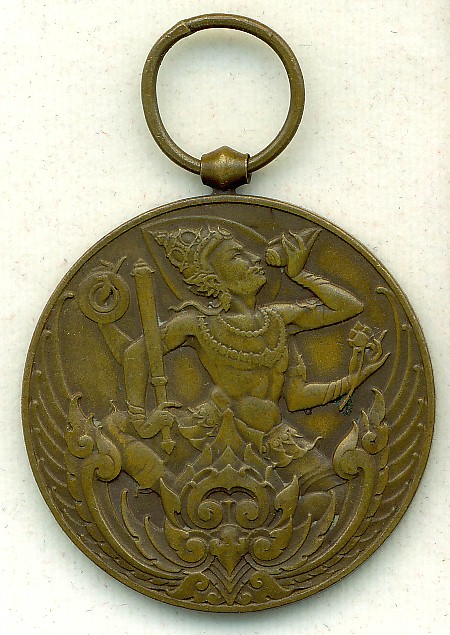
Front: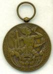
-
Thai/Siamese Victory Medals
Tim B replied to RobW's topic in Inter-Allied Victory Medals of the Great War
Here's another one with some close-ups to follow. Tim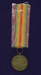
-
Thai/Siamese Victory Medals
Tim B replied to RobW's topic in Inter-Allied Victory Medals of the Great War
Hi Paul, According to Laslo, approximately 1500 medals were issued, though he goes on to only call out about 1200 personnel that actually went in theatre in 1918. Of those, it appears the motor transport personnel were probably the ones that really earned it as they were heavily shelled by artillery. The pilots were still in training when the armistice was signed. Though they were probably the smallest force and came in around September 1918, they were the source of national pride back home. I haven't got one yet and am hoping to trip over one some day during my visits to my family over there. Not much chance though, if they still exist, I imagine they wouldn't be in good shape or you really have to watch out for copies. Not a concern maybe back in the 1920's, but these days, everything is copied and pretty well at that. I have only seen a handful for sale that I would even consider geniune or close enough to really look at it. Lot's of copies on the market and even those are expensive. Tim A couple examples that I've seen for sale over the recent years. Most are three figures$$$
-
dcollect, Okay, so your type 2 variation 3 is different from the three examples I shown above, looking at the lettering and crown rays. Can you post larger PICS of the Variation 4? Also, how sure are you that it is in fact a restrike? I very well may have this version but I would like to confirm it with better/larger PICS first. How common is the restrike? Thank you! Tim
-
Hi Rob! Nice to see you collect other stuff other than Victory Medals In my opinion, your Type 1 is the same as mine, just slight differences in lighting and wear, but IMO, they are the same. Tim
-
Hi dcollect! That's a nice site and great work on the Fire Cross! I think I see two new variations on the type two compared to the three examples I posted earlier. Tim
-
Victory Medal Ribbons in General
Tim B replied to Tim B's topic in Inter-Allied Victory Medals of the Great War
Yes, never held much hope for it, actually pick it up as the ribbon colors looked bright and the PICS weren't that great; was hoping... I will try to get my Czec and British ones photographed sometime later today and hopefully start posting those as one of my Czech pieces has a similar ribbon but the colors are slightly blended. Tim -
Beautiful examples Rob! I have three that I need to take PICS of and post. All three are O. Spaniel types and now that I see the differences between the barrels and cylinders, I will have to look closer and see what I got there! Love those ribbons, wish my examples still had those colors to them. Tim
-
Belgium Belgian Croix de Guerre's
Tim B replied to Tim B's topic in Northern European & Baltic States
Wow, I must admit, I'm surprised. I tried like hell to manipulate the PICS to get that piece looking bronze and I just couldn't do it without distorting the rest of the medal completely off color and even then, the color wasn't really bronze enough IMO. Usually, all you have to do is play with the saturation or toning (sometimes the hue) and you can get close to what the original colors would be. I do this often as most sellers either enhance the shot to make the colors or details come out and you end up with something less than expected, so you learn the hard way. On this one, I just couldn't get it to go bronze and in hindsight, should have asked the seller, but I just wasn't that interested. Oh well. I do understand and agree with your comment that IF the piece had been made out of real silver, the quality would have been better and if there were any content marks, the seller probably would have used those to boost the price, if he knew what to look for of course. His auction description actually referred to it as the Military Cross, and not the Cdg or War Cross. Of course the Military Cross is bronze & black enamel; same design but the ribbon is different. So, the way it looks, no one has seen any regular size pieces made out of silver for these Belgian Cdg's and thats what I needed to know. Many thanks you two! Where is everybody else? Tim