-
Posts
359 -
Joined
-
Last visited
Content Type
Profiles
Forums
Blogs
Gallery
Events
Store
Everything posted by Utgardloki
-
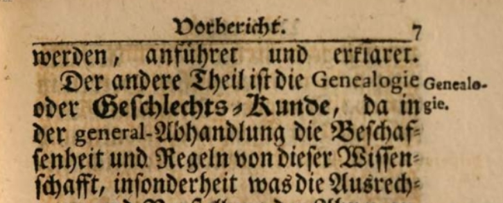
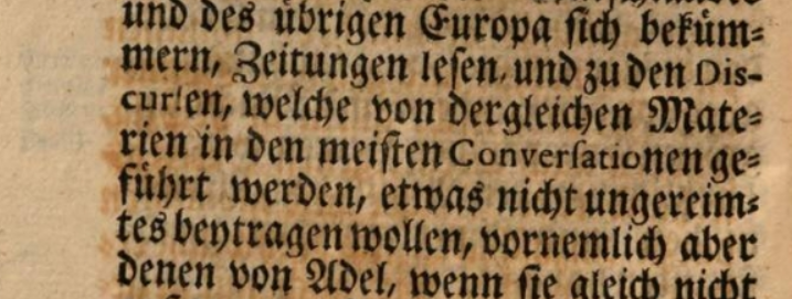
That's cause there were 2 different writing styles taught in Germany (the wohle German Sprachraum actually - including Austria, Switzerland etc.) Both in printed texts and handwritten ones. Everything in German was written in the German font, everything in romance languages in Latin font. For printed German text a gebrochene Schrift (broken font) or blackletter ist used, for printed text from a romance language a runde Schrift (round font) is used, the Antiqua (which it is the dominant today) They were very strict with this, even germanised words from romance languages were set in Antiqua. Here for example a book about heraldry, I was reading lately from 1714: Geneologie is printed in Antiqua as it has no German origin. It goes so far that when a word originating in another language, that is germanised, the root of the word is set in Antiqua, but the part, which comes from German grammar, is set in the broken font. Here for example Conversationen (english: conversations) has the Latin root "conversatio" set in Antiqua, but the ending "nen", which is there to make it apply to German grammar is set in broken font For handwritten texts there was/is also a broken variant and a round variant. The round variant is more or less equal to the englisch cursive and can be called Lateinische Schrift (Latin font). The broken variant, used for German language words (therefore of course also in your postcard) uses almost (not really as still is just a style of the Latin alphabet) a completely different set of letters (at least one gets the impression it is so), which is oriented on the broken printed letters. Now it mostly is called Kurrentschrift or Sütterlinschrift, which both isn't satisfying to me (actually annoys me, but of course one can use the terms cause anyone knows what is meant). Why? First Kurrentschrift comes from currere (latin running, german laufen), so just means Laufschrift (roughly running or current font or just cursive font), which just means that the letters used in a word are connected (made without lifting the nib). That is also true for the round, the Latin font, it also is a Kurrentschrift which one can actually call lateinische Kurrentschrift (Latin running font or latin cursive), if one wants to. So in conclusion Kurrentschrift isn't a satisfying term to distinguish the fonts. Second Sütterlinschrift is even worse. It is a handwriting font designed by Ludwig Sütterlin in 1911, that is just a simplified, easier to learn version of the earlier used ones, that you can write without a flexible nib (the stroke has the same thickness everywhere). And now there is the punchline: Of course he designed a German (broken) one and a Latin (round) one. There are 2 different Sütterlinschirften. So again this term actually can't be used to distinguish both. How should we call it? The broken font: gebrochene Schreibschrift (broken handwriting) or deutsche Schreibschrift (German handwriting) The Latin font: runde Schreibschrift (round handwriting) or lateinische Schreibschrift (Latin handwriting) It is actually no shame to be unable to read it, you have to learn it, almost like learning a different alphabet. Almost no german-speaking person is able to read it, the young ones don't even no it existed (I am quite young too, and most of my friends and acquaintances of same age hardly heard of it). Why? In Switzerland is was already abolished earlier (beginning of 20th century) I think, but I don't know exactly. In the rest of the german-speaking countries it was abolished with the Normalschrifterlass (literally normal-font(writing)-decree) in 1941. Both the printed broken letters and the handwritten ones were no longer used. The national-socialists made an obscure connection of it with Jews and therefore it should be abolished, somehow ironic as today blackletter is almost always used in films etc. when referring to the Nazis. In the 1950s and 60s it was again taught, but hardly used and therefore slowly disappeared. My grandmother (born in the 30s) for example can more or less read it, but no longer write it. Another interesting fact is, that when I was in primary school (which isn't that long ago), we still called the connected handwriting Lateinische (The Latin), although we never heard of a "The German". Later in school my math teacher, who was into such things and actually learned it in school (born in the 1950s I guess), sometimes used it jokingly to label vectors in math (like it was done it the past; convenient to have a third set of symbols, beside the Latin and Greek ones) to confuse us. That's were I actually first got interested to it and started to learn to write it (both the German Sütterlin variant and the older one done with a flexible nib). And in my opinion learning to write it is the easiest way to also learn to read it. PS: It was a widely used practice to write names in the Latin font, like in Your postcard. Some people tended to write only in the Latin font, that's why you said some are easier to read. Would be nice if You post it
-
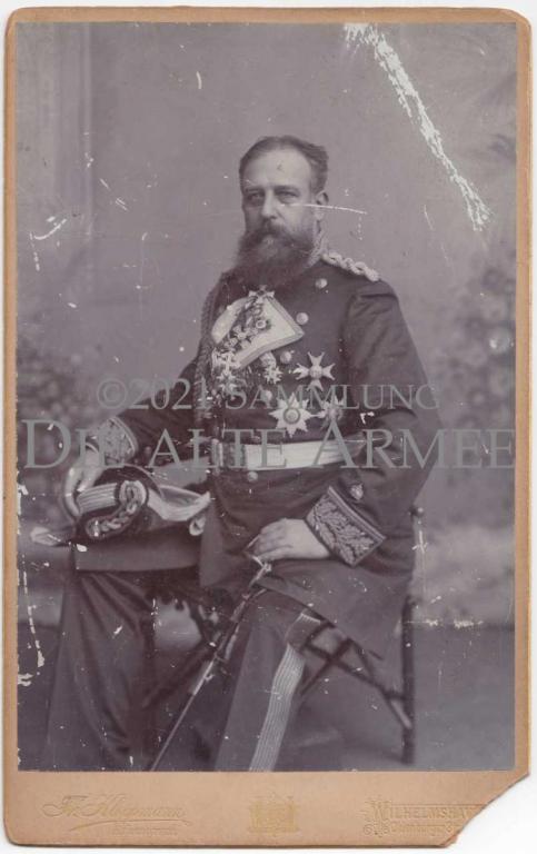
I took the picture from the website of the Museum für Kunst und Gewerbe Hamburg (maybe I should have named the source; they put it in public domain by the way, which is nice) https://sammlungonline.mkg-hamburg.de/de/object/Graf-von-Eulenburg/P1976.857.952/mkg-e00136665?s=*&h=0&f[]=subjectActor%3AEulenburg und Hertefeld%2C Philipp zu They named it to Philipp zu Eulenburg, what I took over here. But You are right, also from looking at photographs of both I think it is clear it is in fact August zu Eulenberg.
-
I overread that he had the red eagle 4 with swords. That makes it clear, it is the war ribbon. I guess he got it in 1866? I think it is better to not link the black-white war ribbon only with the Iron Cross in our minds, but as its own entity, cause it was there before (first with PlM?, the Ordre de la Ordre de la Générosité had a full black ribbon to my knowledge.) and only happens to be the iron cross ribbon, cause it is a war-only decoration. Was the jerusalem cross only worn as full decoration on the Überrock, cause I never saw a picture with only its ribbon being worn on it
-
The text is: Sent to: Hedwig Dellbrügge Düren Moltkestraße(? not 100% sure) 32 Iserlohn, 30.11.18 Sehr geehrtes Fräulein! Seit einigen Tagen gut in Iserlohn, wo wir jedenfalls noch länger bleiben. Ich erlaube mir Ihnen diese Karte mit meinen besten Grüßen, auch an Ihre werten Eltern & Frl. Schwester zu senden Ergebenst ??? rough translation: Dear young lady (miss)! Since some days good in Iserlohe, where we gone stay longer. I take myself the liberty to send You this card with my best regards, also to Your valued parents and sister. Sincere ??? So a pretty generic text, with little information for us collectors
-
Now searching for him in the forum, I found the thread again with the Hawaii order. There Geißler was als discussed a lot. There is also an Austrian order of the Iron Crown 2nd class, he is wearing below the St. Stanislaus (How could I not see it, it is one of my favourite decorations) Neck badge number 2 seems to be the württembergian Friedrichs-Orden Komtur 2. Klasse
-
I would love to know who this admiral is, he's wearing: neck insignia: 1: KO2 2: maybe hessian Philipp order ? 3: I remember seeing this one, but forgot what it is 4: Zähringer Lion commander 2nd class 5: Order of Saints Maurice and Lazarus commander 6: Swedish order of the Sword ? 7: Russian St. Stanislaus order breaststars: 1: a Scandinavian insignia ? 2: Russian St. Stanislaus order breast star 3: Chinese order (maybe double dragon) ? medal bar (left to right): 1: maybe RAO 2: long service 3: 1870/71 medal 4: centenary medal 5: what's that again?
-
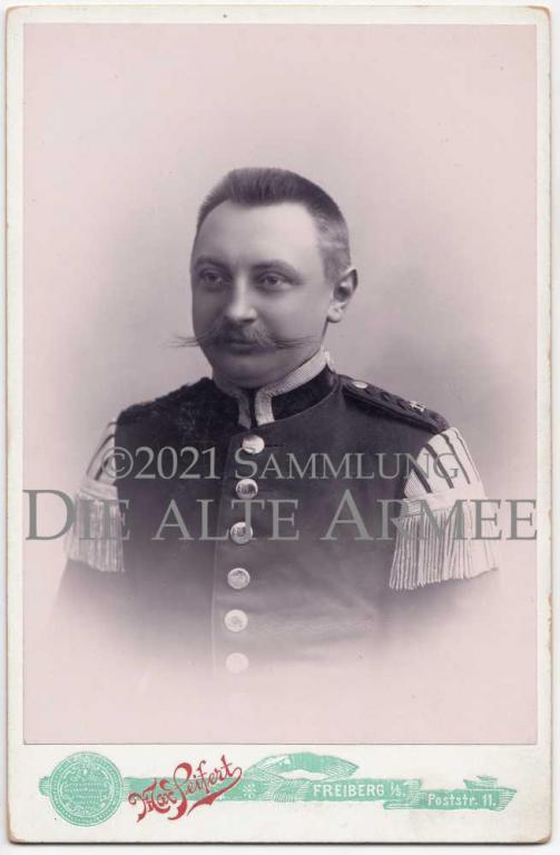
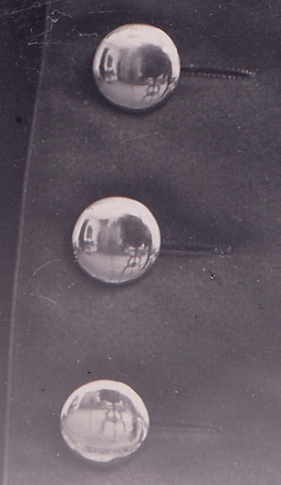
I have this photograph of the later Musikmeister Karl Giltsch - here in the uniform of a Stabshoboist of the 1. Jäger-Bataillon Nr. 12 (is this the uniform of a Stabshoboist? How do they differ from a Musikmeister ones?) What is very interesting about this picture is that one can see the camera it was taken with on the reflections of the buttons.
-
That is the same that I read some years ago; true; after the new laws the titles became part of the name (not really as there is still the male and female form), so it is always "forename - title - surname", but this way of writing the names was already popular before. In Austria even more common than the title in front of the fist name form. It is most of the time something like "Franz Fürst Dietrichstein" or "Franz Fürst von Dietrichstein" not "Fürst Franz von Dietrichstein"; so it can be concluded that both forms were used before 1920.
-
Thank You for replying. I heard that too, but I think it only led to very few deaths. I don't believe a major reason for high casualties were ribbon bars. And I wasn't referring to this unit, but rather generally. The info about those fallen officers above again strengthened my feeling that during the first months of the war the casualties among officers were very high. The reason might have been that the form of fighting war wasn't adapted to the new weaponry at that time. But maybe I am just wrong, it was only a "Bauchgefühl" as I would say in German. What would interest me is if there were more casualties among officers in the first months of WW1 compared to earlier wars and the later years of WW1.
-
Marine–Korps Flandern
Utgardloki replied to cath's topic in Deutsche Kaiserreich: Man spricht Denglish
So; here is the rest: The third letter: 1. Marine-Inf.-Reg. 3. Komp. Im Felde, den 31. März 1918 Sehr geehrte Frau Sasse! Ich erfülle hiermit die traurige Pflicht Ihnen davon Nachricht zu geben, daß Ihr lieber Mann, der Seesolfat d. Lands??? Otto Sasse, am 26. März 1918 im Angriffsgefecht bei St. Albert auf dem Felde der Ehre gefallen und somit den Heldentod für's Vaterland gestrorben ist. Die Kompagnie verliert mit ihm einen bra- ven, guten Soldaten, der in treuer Pflichterfüllung für das Wohl seiner Lieben in der Heimat alles hingegeben hat. Möge Ihnen daher in dem großen Schmerze um seinen Verlust der Gedanke ein Trost sein, daß sein Name in der Geschichte des Regminets für alle Zeit fortleben wird The Iron Cross letter: 1. Marine-Inf.-Reg. 3. Komp. Im Felde, den 15. 11. 1917 An den Seesoldaten Otto Sasse Reserve-Lazarett II Marienkrankenhaus, Hamburg Die Kompagnie sandte heute an Ihre dortige Dienststelle, das Ihnen auf die Eingabe der Kompagnie hier, verliehene E.K.II. und bringt hierzu den herzlichsten Glückwunsch zum Ausdruck ????? Leutn. u. Komp. Führer And what's really sad, the backside of the photograph wich is dedicated to the third anniversary of the marriage to his wife. It cites a stanza of the poem "Ein Epilog" by Theodor Storm: Meinem lieben Mausel(?), zum 6 Jahrestage unserer Ehe! Zage nicht, es muß sich wenden Und heiter wird die Welt erstehn, Es kann der echte Keim des Lebens Nicht ohne Frucht verloren gehn. Flandern im Sept. 1917 Dein Otto! Unfortunately it took so long for someone to react to this post; I hope the opener of this thread is coming back, so we can see the photograph of Otto Sasse. -
Marine–Korps Flandern
Utgardloki replied to cath's topic in Deutsche Kaiserreich: Man spricht Denglish
As there seems to be interest, here is the second letter: Im Felde, den 3. Mai 1918 Hernn Bruno Abehitz, Bln.-Schmargendorf Die letzte hiesige Gefechtstätigkeit macht es der Kompagnie erst heute möglich Ihr wertes Schreiben vom 10.10. Mts. zu bestätigen. Auf Ihre Anfrage sei Ihnen zur Kenntnis, daß Ihr Stiefvater, der Seesoldat Otto Sasse, am 26. März 1918 nachm. 5:30, als die Kom- pagnie aus dem Orte la Baiselle nach Albert mar- schierte, durch die Wirkung einer in die Kompagnie eingeschlagenen feindlichen Granate sein Leben mit noch mehreren Kameraden lassen mußte. Ein Splitter in die Brust hatte sein Ableben auf der Stelle be- wirkt. Beerdigt wurde er links der Straße Bapaume - Albert, etwa 200 vom Südwestausgang von la Boiselle mit noch fünf Kameraden seiner Kompagnie in einem Grabe. Von dem Beerdigungskommando ist die Erkennungsmarke seinerzeit nicht nach hier zurückgegeben worden und dürfte es wohl aus- sichtslos sein noh in den Besitz derselben zu gelan- gen, zumal die Truppe welche die Beerdigung vornahm, später selbst ins Gefecht eintrat. Die Nachlaßsachen wurden dem auf dem Felde der Ehre Gefallenen von einem Manne der Kom- pagnie abgenommen. Dieser wurde dann selbst verwundet und ist es ihm deshalb scheinbar nicht mög- lich gewesen die einzelnen abgenommenen Sachen alle zu bezeichnen, da ein Teil derselben hier ohne den Vermerk über den Eigentümer einging. Die Kompagnie hat sich bereits mit dem Manne in Verbindung gesetzt und wird Ihnen nach Abschluß der eingeleiteten Nachforschungen von dem Ergebnis Mitteilung machen. In voller Erkenntnis, welche schmerzliche Lücke der in feindlicher Erde schlummernde Krieger seinen lieben Angehörigen hinterlassen hat, wi- derholt die Kompagnie ihre tiefste Teilnahme an dem großen Schmerze. Hochachtungsvoll Schnackenberg Leutnant d. R. u. Komp. Führer -
Marine–Korps Flandern
Utgardloki replied to cath's topic in Deutsche Kaiserreich: Man spricht Denglish
Thanks for sharing, interesting documents, showing the horrors of war Here the quite moving first letter: Im Felde, den 15. IV. 1918 Sehr geehrtes Frl. Schusch.. (?)! Auf Ihre Anfrage vom 8. IV. über den Tod Ihres Onkels, des Sees. Sasse(?), kann ich Ihnen Folgendes mitteilen: Beim Vorge= hen auf Albert am 26. III. erhielt die Komp. einen Volltreffer, bei dem Ihr Onkel durch Kopfschuß fiel. Er war sofort tot und hat nicht gelitten. Mit fünf anderen gefallenen Kammeraden ist er beerdigt worden. Das Grab liegt östl. Albert in einer Mulde, wo er den Heldentod gefunden hat an der Straße Albert-Bapaume Unter den augenblicklichen Kampfhandlungen ist es natürlich schwer, eine Photographie des Grabes zu machen, aber später wir es natürlich möglich sein. Hochachtungsvoll Schna... Ltn. d. R. u. Komp. Führer. -
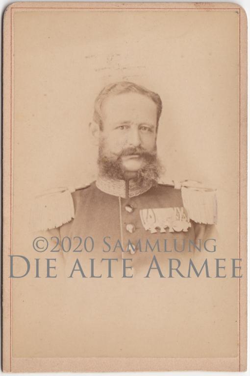
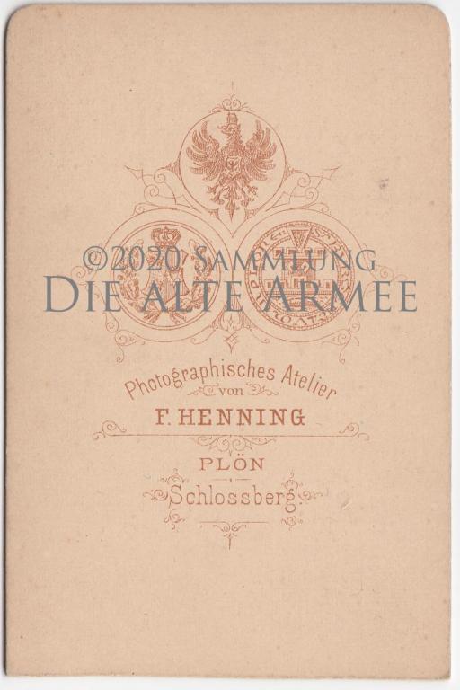
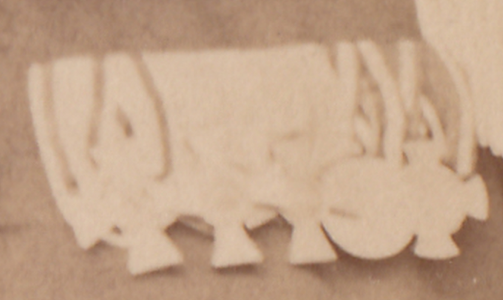
The picture was taken in Plön and he is wearing: RAO4; KO3; Dienstauszeichnung; 1870/71 medal ? ; one of the 1866 crosses? so I concluded it has to be Oberstleutnant Billig, cause the decorations would fit; he might got the OV3 WF3a after the picture was taken. could this be a possibility or could I be wrong? (entry from the 1914 ranklist)
-
The article I posted above states an enlargement was already done in the 1920s. I wonder if this one with the circled enlargement is the only one around. I would call it highly suspicious if there isn't a high resolution version of this picture with Hitler in it, from which everyone in the crowd can be enlarged in the same quality. I hope it's clear what I mean, it's hard in English...


